Many of us love to “geek out’ on color…whether it be with tools, materials or terms. There isn’t always agreement about what each term actually means, and some of them seem to overlap. Maybe some color terms cannot be neatly tied up in one definition.
Let’s perceive this post as an exploration, an investigation, and a drilling down into some of the color terms we use every day Well, the color terms we may use often, without truly thinking about it, or considering what they mean.. Perception…that’s the ticket! We’re going to take this slowly, step-by-step, working (and playing) through the terms, like Noah’s Ark, two by two. We started at the beginning, with Color & Hue. We worked our way through Colorfulness & Chroma. Now let’s look at the intertwined concepts of Saturation and Intensity.
Many of us use the term “saturated” often…and the term “intensity” even more. But, what do they mean? is there even an agreement as to what they mean?
Saturation has been described as the strength of a color, the dominance, and/or vividness of hue in a color, the intensity of a color,, the degree of difference of a color from a gray of the same lightness or brightness as the color. Saturation is one of the three aspects by which a color is described, the others being hue, and value.
We learned that “Colorfulness can be defined as ‘”the degree of difference between a color and gray…and Chroma is the colorfulness relative to the brightness of another color that appears white under similar viewing conditions.”
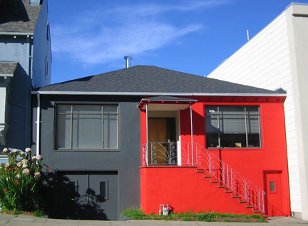
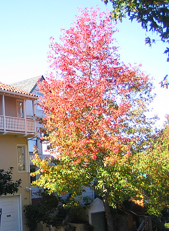
Saturation may be defined as “the colorfulness of a color relative to its own brightness.” or “ the degree to which it is different than gray at a given lightness.” Saturation measures the degree to which a color differs from a gray of the same darkness or lightness.”
Thus, the Saturation aspect of a color may be defined as how far is from gray (“Colorfulness”), as regards to the aspect of “ visual perception in which a source appears to be radiating or reflecting light.”, or, Brightness. Thus Saturation relates to Brightness, which relates to to Luminance, which will be discussed in a subsequent post!
We have ascertained that “unpacking’ these Color Terms is akin to a a tongue-twister AND a brain-teaser!
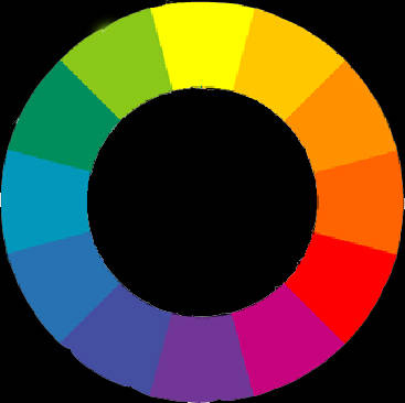
To desaturate, (lessen saturation, or make less intense, give the appearance of being less strong, or, less full of, color) in a subtractive system, such as paint color, gray, black, white, or the complement (the color opposite on the color wheel) of the color in question can be added. All will serve to lessen the intensity, strength, “purity”, concentration, and / or colorfulness of the color, and thus make it less saturated.
The term “Intensity” is often used interchangeably with “Saturation”, by painters and others. I prefer to think of the term “Intensity” as a descriptor or adjective of “Saturation”. “ Also known as “intensity,” saturation describes the strength of a color with respect to its value or lightness. What that means is a color’s saturation is the degree to which it is different than gray at a given lightness. For instance, colors near middle gray are relatively unsaturated compared to brighter, more vibrant colors….”–http://www.colorcube.com/articles/theory/theory.htm
“….saturation tells us how a color looks under certain lighting conditions. For instance, a room painted a solid color will appear different at night than in daylight. Over the course of the day, although the color is the same, the saturation changes. This property of color can also be called intensity. Be careful not to think about SATURATION in terms of light and dark but rather in terms of pale or weak and pure or strong.”–http://www.colorcube.com/articles/theory/glossary.htm
Remember, Saturation is related to brightness, light, and luminance.
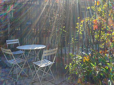
Well, I hope your brain is not completely scrambled! It may be time to take a deep breath, relax, let our minds unwind, and take a moment to simply enjoy and revel in color…and saturate our soul and senses with it…pure, intense and full.
Join us for our “Color Muze” on Rebecca E. Parson’s “Artistically Speaking Talk Show”, and learn more! The third Sunday of the month…7:15PM EST, 4:15PM PST! See you there!
Leave a Reply