We have so many situations in our lives when we are called upon to make color decisions. Whether it be for our homes, our appearance, our mode of transport, our creative endeavors, our web presence, or our work….the colors we choose play a huge role in our lives.

Our color choices both express us…from the inside out, as well as affect how we are viewed..from the outside in. Thus in our creative expressions, the “branding” of our businesses, and the sum total of our visual identities, color is a defining factor that communicates who we are, where we are at, and who we aspire to be, simultaneously.

I recently had the opportunity to work with a beloved colleague who needed a color consultation for her marketing client. The color purple had been chosen for the client’s logo, but my colleague thought the purple hue could be tweaked a bit, and wanted both a suggestion for a color to compliment the purple, as well as information on the meaning of the recommended colors.


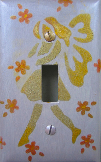
After reading about the client and her business, and viewing the logo and the initial color of purple chosen, I knew the appropriate compliment was just that, the compliment of purple: yellow (well…gold/ochre tones of yellow). Complimentary colors are those opposite each other on the color wheel, and just like black and white these dynamic duos set each other off, and well, compliment each other!

I know that blue would be too cool, and too close to purple, as it is one of its components. The same for red. I knew orange would be too bold with the purple, and green too varied. All of these could be beautiful combinations, but not for the purpose we were trying to achieve, the communication of the client’s brand, or as I like to think of it, her essence; that which she has to offer. It had to be gold…in an earthy, ochre tonality. One way to tone down, or “kick back” (bring down the intensity and brightness) of a color is to add a quotient of its complement, or opposite…in this case, purple!

I also recommended warming up the cool, ethereal shade of purple initially chosen by the client by upping its quotient of red, which would work well with the earthy tone of gold/ochre I suggested.

The meaning of the recommended colors was accessed from a number of vantage points, in regards to everything I was given to understand about the client, her message, her intentions, her history and life experience, her current situation, and future intentions, as well as her hopes, plans and purpose. The colors had to reflect and communicate all of these, and feel completely authentic to her as well.
Please tune back in next week for part two of our series Color for all Reasons, and learn about the meaning of the colors for this very special client and her business. You can learn how You can access the colors that you choose from a variety of perspectives, that can illuminate, support and enrich your color choices, and hopefully make them less agonizing.
What color choices have YOU had to make lately, and how have you made them?
If You feel so inclined, please share about them with us here.
We love to hear from you.
Remember, we are all adding color to this thing called Life, together.
Thanks for joining us on the journey…


Leave a Reply