Many of us love to “geek out’ on color…whether it be with tools, materials or terms. There isn’t always agreement about what each term actually means, and some of them seem to overlap. Maybe some color terms cannot be neatly tied up in one definition.
Let’s perceive this post as an exploration, an investigation, and a drilling down into some of the color terms we use every day. Well, the color terms we may use often, without truly thinking about it, or considering what they mean. Perception…that’s the ticket! We’re going to take this slowly, step-by-step, working (and playing) through the Terms, like Noah’s Ark, two by two. We started at the beginning, with Color & Hue. We worked our way through Colorfulness & Chroma and Saturation & Intensity, (which was, no pun intended…tee hee…intense!)
 Luminous Intensity
Now we are ready to wind up the series with a look at the concepts of “Brightness and Lightness“, which sounds like a definition of Grace. May this exploration (just can’t quite call it a romp…drilling down into the definition of these Terms does take some fortitude!) be an illuminating experience for us all.
 What is “Brightness”?
Brightness is an attribute of visual perception in which a source appears to be radiating or reflecting light.[1] In other words, brightness is the perception elicited by the luminance of a visual target. This is a subjective attribute/property of an object being observed.
In other words..the experience of “brightness” is “subjective”, or personal which can vary from person to person, as I understand the latter definition. We experience “brightness’, as a response to the scientific phenomena of “Luminance” ...a photometric measure of the luminous intensity per unit area of light travelling in a given direction. It [Luminance] describes the amount of light that passes through or is emitted from a particular area, and falls within a given solid angle.
Thus, Brightness is what we see/perceive/experience as a result of that travel and “fall” of Light. Still poetic.
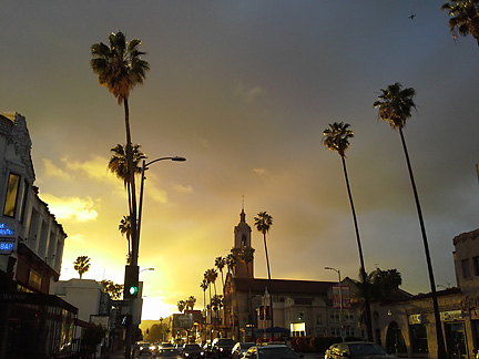
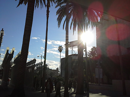
 Speaking of Light…
What is “Lightness“…and how does it relate to “Brightness”…(besides rhyming with it…and creating poetry!)
Lightness (sometimes called value or tone) is a property of a color, or a dimension of a color space, that is defined in a way to reflect the subjective brightness perception of a color for humans along a lightness–darkness axis. – http://en.wikipedia.org/wiki/Lightness
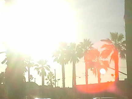
 Speaking of Light and Shadow…
Key here is the phrase “…along a lightness-darkness axis.” “Value” is the property, aspect or dimension of color that references its relative lightness or darkness. We may speak of “That is a sky blue, lighter in value, then the darker midnight blue of the night sky.” Also note the use of the word “subjective” (“…defined in a way to reflect the subjective brightness perception of a color for humans…“). Our perception of Brightness is to at least some extent, personable and variable. The measure of Luminance, which causes the level of brightness that we perceive, is an amount. Lightness refers to our perception of Brightness in terms of lightness to darkness. This is about as far as I am able to break it down at this time!

At one time in San Francisco, there was a Theatre Company called “Thick Description“. This term also refers to an explanation of behavior, as well as its context…so that it can become meaningful to to others. Sounds about as “thick” as our attempt to clarify the meaning of the Color Terms we use.
We may have to work through the “Thick Descriptions”, but my hope is for this series of post to shed some Light on Color…for YOU! Out of the Darkness..into the Light…and Color! We know Color is an effect of Light…after all.
Cheers!
Leave a Reply