It’s that time of year that we all await…the release of Pantone’s Color of the Year for the coming year. So it is here…
PANTONE 18-1438 Marsala
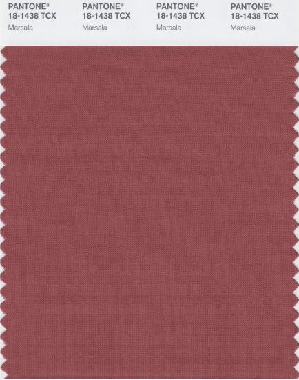
Interesting on its own and a wonderful contrast for other hues, PANTONE 18-1438 Marsala serves as the foundation to the Spring/Summer 2015 palette. Sensual and bold, delicious Marsala is a daringly inviting tone that nurtures; exuding confidence and stability while feeding the body, mind and soul. Much like the fortified wine that gives Marsala its name, this robust shade incorporates the warmth and richness of a tastefully fulfilling meal, while its grounding red-brown roots point to a sophisticated, natural earthiness. –Leatrice EisemanExecutive Director, Pantone Color Institute
What Will I Do With Marsala?
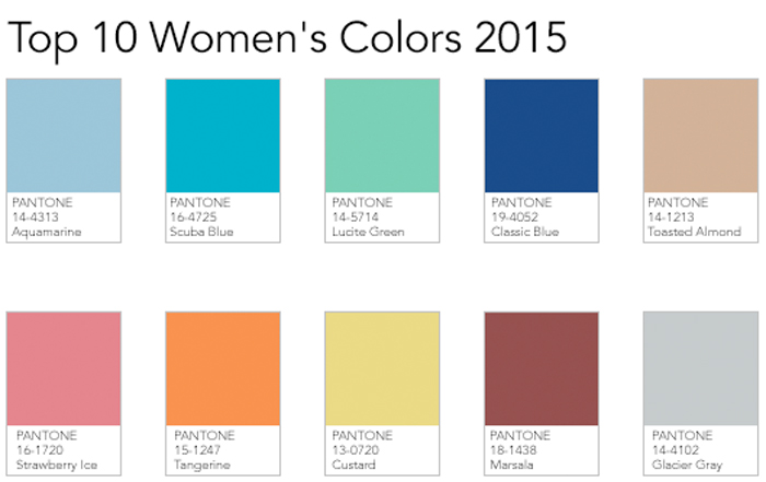
The reddish-brown color pairs well with: PANTONE 14-4102 Glacier Gray and PANTONE 14-4313 Aquamarine. It reminds me of terra-cotta tiles with a twist. It is a burgundy, but not the burgundy of the 1980s or 90s. It has rose undertones and will make a good neutral.
I am not a brown lover. As an artist it just does not do anything for my colorful eye. I prefer bright and happy colors. Marsala does not seem happy to me. I will probably not be rushing out to find the perfect Marsala accessories. I am not much of a trend follower. I love the beachy spectrum in home and fashion.
What can you do with Marsala?


Leave a Reply