On March 20, 2011, during our Color Muze segment on Artistically Speaking Talk Show, I had the opportunity to chat with hosts Rebecca and Lyna‘s delightful guest, mixed media artist Kelli Perkins about color temperature, colors that advance and recede, and the relationship between the two. Playing off our previous discussions of “Synesthesia“, or, “The Unity of the Senses“, the idea that colors provoke associations our senses other than sight, during this Muze, we focused on which colors seem to advance, and which to recede. This effect is particularly salient as regards to architectural color, as it can be used to make a space feel larger,
or smaller….
For example, if we paint the walls a color that seems to advance towards us, the space itself will feel smaller. Doing the opposite can create the opposite effect. This technique can be used in any visual context. Using colors that advance and recede can create movement or stillness, dynamism or placidity, agitation or peacefulness, in paintings, textiles, clothing, or anything that uses color as an element. Artists, take this to heart. Kelli does use color! Warm, saturated, and often secondary (purple, green, orange) color! She uses it intuitively and instinctively, even giving herself luminescent purple hair in a self-portrait. Check it out, you have to see this!
But what makes a color seem to advance or recede? And, what qualities do those colors have?
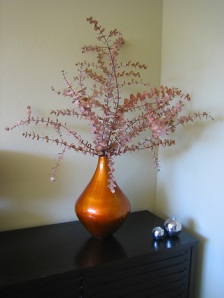
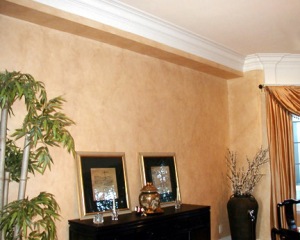
Well, for one thing, how warm or cool a color is perceived to be plays a major role. If we consider the color wheel, we can see a warm half of the wheel, red through yellow-green, and a cool half, green through red-violet. In terms of our perception, warm colors seem to advance, and cool, to recede. When we talk about color “pop”, it refers to the advancing quality of that color, making it “pop” out at us, like the brilliant orange vase in this room.
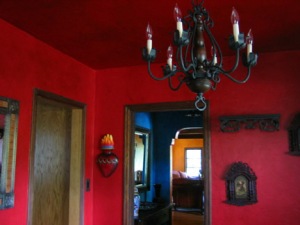
Warm to hot colors will seem to advance, making the surfaces sheathed in them seem to be closer to you, thus making a room seem smaller, cozier, and, of course, warmer. Often, we want this, and a cavernous space may need it to feel livable.
Cool to cold colors will seem to recede, making the surfaces they sheath feel farther away from us, thus visually adding space, or volume, to a room. This sense of space can be calming and refreshing, especially on a hot day!
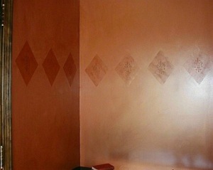
By the same token, dark, saturated colors advance and make a space feel smaller, and more intimate,
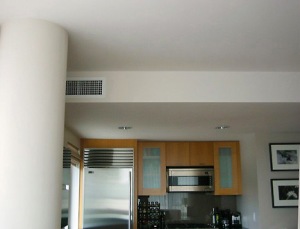
while pale, light colors, with less saturation add volume by receding. offering a sense of spaciousness, and potentially, rest and relief.
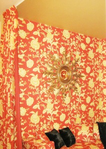
And for sure…strong, bold busy pattern advances! This intimate boudoir becomes yet more magical, fantastical and fun with the addition of this totally HOT fabric wallpaper and curtain!
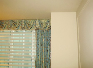
Smaller, more subdued pattern also recedes. Here the cool blue elegance of the drapes is warmed up by the detail, which brings them to the same plane as the surrounding white walls. The walls themselves recede in lightness of color, advance in warmth of tone, and recede in absence of pattern! Wow. This advancing and receding stuff can be complex. Almost like a math problem. But, ooh, how fun to contemplate!
An interesting discovery can be made when considering our use of language, vis-a-vis not only color, but temperature, AND the idea of advancing and receding. Let’s listen to what we say, what we think, and how we describe relationships, or even our own emotions and personalities. When someone, or even our self, is being or feeling cool, or cold, we often describe that behavior as distant. Or, visa versa, if someone seems remote, or distant, we may jump to the conclusion that they are “cold” or “cool”, emotionally. We may even feel cold or cool ourselves, when we feel emotionally distant from another person, experience, or something we see, or do.
Conversely, when we feel intimate and close to others, to our experience, to ourselves, to Life, we may feel warm, or even hot (!). How often do we say, “I feel so cool and cozy!”? Never, I would venture to guess. Not if we aren’t characters in a J K Rowling fantasy! When we feel warmth towards or from another person, they feel “close” to us, and we feel close to them. . It would be hard to feel close to someone, to our authentic selves, or to our experience, and feel cool or cold. When we say, “Person X is so warm, I feel so close to him/her.”, we are equating emotional temperature with emotional proximity, and the idea of emotional color advancing and receding within ourselves and others.
There is much to contemplate here, and this could be the subject of a whole new post. Have you ever felt the temperature effect, either emotionally, or physically, through color? Have you used color deliberately, to expand or contract the perceived volume of a space? Have you noticed your own telling use of language to describe either?
Here’s wishing you both color and emotional mastery, magic and adventure. It’s hot!
Debra Disman
Debra Disman’s passion is to translate her Client’s inner vision into concrete visual form. She is principal of ArtiFactory Studio, a decorative painting company based in San Francisco, which provides custom decorative painting, murals, and color consultation to customers from all backgrounds and walks of life. She is an Associate member of the International Association of Colour Consultants/Designers and serves as the Color Muze for blog talk radio’s “Artistically Speaking Radio”. To learn more please visit ArtiFactoryStudio. You can also connect with Debra on TWITTER, FACEBOOK, or LINKED IN, or on her blog, “Artissima“.




Such a pleasure to work and play with you Rebecca, in the Cre8tive Sandbox! Telling those stories!
All the best,
dd